Na Liang Market
A friendly market with the concept of benevolent circulation.
The inspiration behind the name "Na Liang" comes from the homophone "enjoying coolness," symbolizing the tradition of planting trees for future generations to enjoy the shade. Our goal is to create a space where like-minded partners can rest and relax, supporting each other to create a better life experience. We are dedicated to promoting benevolent businesses, caring for animals, plants, and life on Earth. Based on this philosophy, Na Liang Market selects excellent suppliers to provide quality everyday products, while also striving to build a brand centered around benevolent circulation through online platforms. We aspire to be a trusted partner to the public, helping them achieve their dreams and making life more beautiful.
那良市集-以善循環為理念的友好市集
那良這個名稱的靈感來自「納涼」諧音,蘊含了前人種樹,後人乘涼的意象。我們的目標是建立一個讓有相同願景的夥伴能休息、乘涼的場所,彼此扶持、守望相助,共同創造美好的生活體驗。我們致力於推動善良事業,愛護動植物與地球上的生命。基於這樣的理念,那良市集精選廠商提供優良的日常用品,同時透過線上平台,致力於打造一個以善循環為核心的品牌。我們期望成為大眾的貼心伙伴,協助他們實現夢想,同時讓生活變得更加美好。
Brand Origin
A group of partners who are managing their own businesses and share the same philosophy came together to establish the market brand "Na Liang." Through activities that allow them to deepen their understanding of each other, they decided to hold the first market event at Fengshan Temple in February 2024. In the initial stages of preparation, there is a need for a comprehensive and user-friendly event logo.
As a market that upholds the concept of benevolent circulation and sustainable living, in order to differentiate ourselves from fast fashion in the commercial exhibition, we need a set of warm, reliable, comfortable, and durable event logos. Setting up an identity that is healthy, natural, friendly, and visually user-friendly during the Spring Festival period of the Fengshan Market event next year is our top priority.
品牌起源
一群經營自身事業、擁有相同理念的夥伴齊聚一堂,攜手創立了市集品牌「那良」。透過活動深入認識彼此,決定在2024二月於鳳山寺舉辦首屆市集活動。籌備初期需要有一個完整好用的活動標標誌。作為一個秉持善循環、永續生活理念的市集,為了與商展中的快時尚區隔,我們需要一套親切、可靠、舒適耐看的活動標誌。在明年鳳山市集活動的春節期間,設定一個健康自然友好且視覺使用便利性高的識別是我們的首要目標。
關鍵字:善循環、環保、親切、自然、可靠、信賴感
關鍵字:善循環、環保、親切、自然、可靠、信賴感
Keywords: Benevolent Cycle, Eco-Friendly, Friendliness, Nature, Reliability, Trustworthiness

Brand Design Requirements
⒈Easy to promote text、⒉High visual consistency、⒊Plant-themed、⒋Warm, reliable, and stable feeling
⒌Convenient and easy to use、⒍Healthy and natural、⒎Friendly and approachable
品牌設計需求
➊ 標誌要容易推廣的文字、➋ 視覺統一性高、➌ 主題扣合植物、➍ 親切可靠的穩重感
➊ 標誌要容易推廣的文字、➋ 視覺統一性高、➌ 主題扣合植物、➍ 親切可靠的穩重感
➎ 方便好應用、➏ 健康自然、➐ 友善親和力


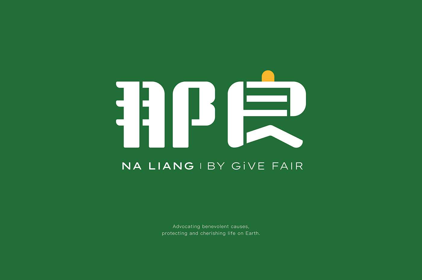

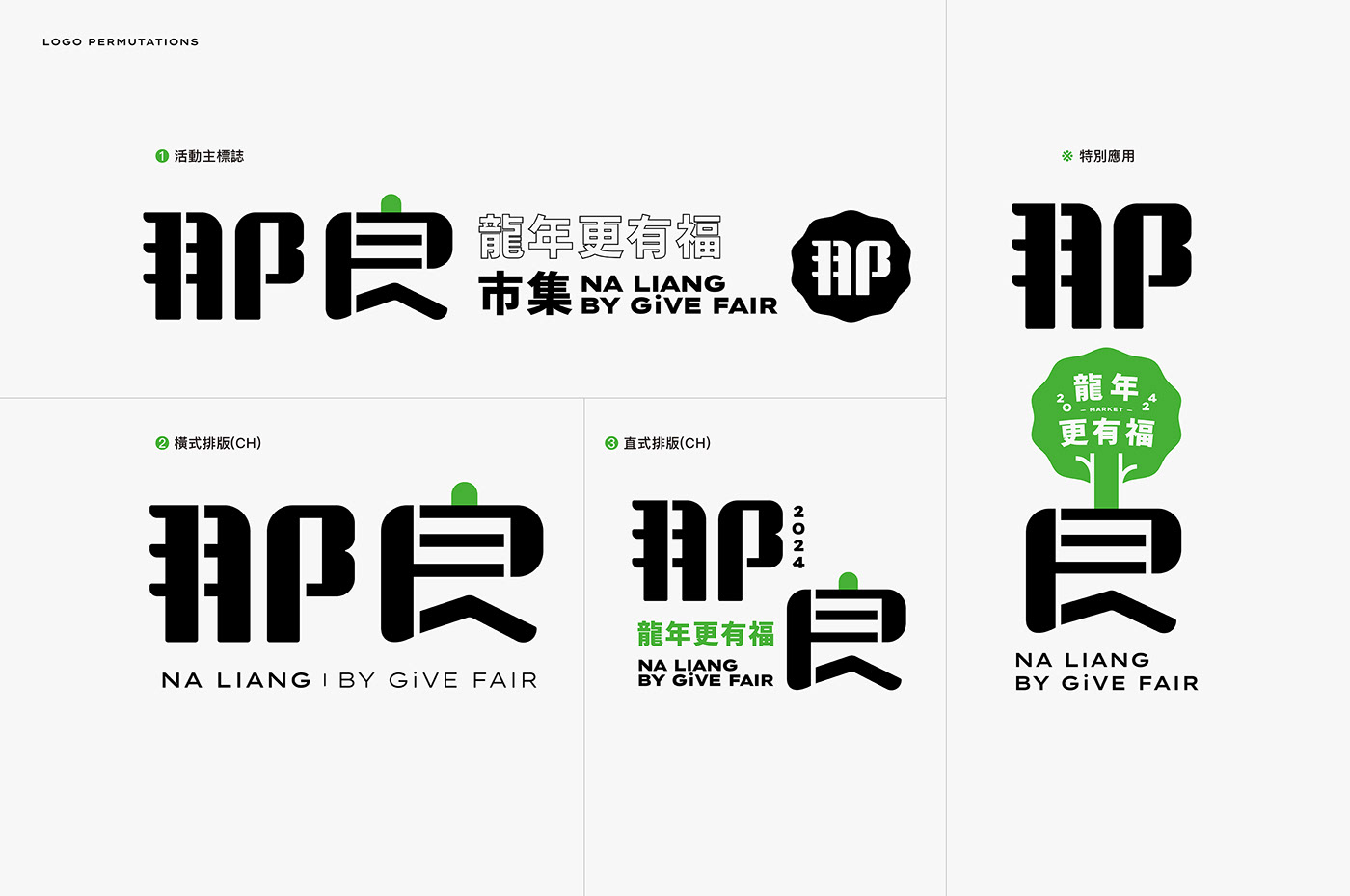
In the font design of Na Liang, two important elements are integrated: the towering tree deeply rooted in the land¹ and the green stroke punctuation marks². This symbolizes the concept of deep-rootedness in the land, flourishing growth, and the beautiful implications of benevolent circulation akin to the lush greenery of bean sprouts. The standard font structure blends rounded and pointed corners, aiming to showcase the brand's friendliness and stability. The smooth lines and solid strokes highlight the brand's flexibility, high recognizability, and comfortable, enduring, and affable image.
As a market that upholds the ideals of benevolent circulation, environmental protection, and sustainable living, besides having a set of warm, reliable, and enduring event logos, we also hope that through Na Liang Market, we can see the seeds of dreams take root and sprout in everyone's hearts.
那良的字體設計中有兩個重要的元素,分別是融入了深居土地的大樹¹和綠色筆畫的逗點²。這象徵著在土地深處扎根,茁壯成長,以及善循環如豆苗般翠綠的美好意涵。標準字的結構融合了圓角和尖角,旨在展現出品牌的親和力和穩重感。線條的圓潤和方正厚實的筆畫突顯了品牌的靈活性、高辨識度,以及舒適耐看的親和形象。
作為一個秉持善循環、環保、永續生活理念的市集,除了擁有一套親切、可靠、舒適耐看的活動標誌,更希望透過那良市集看見夢想種子在每個人心中生根發芽。